

EdTech: End-to-End Mobile App 2025
9 Weeks

Sole UX Designer

Figma, Miro, Zoom, Photoshop


Creature Quest is an educational gaming app that uses augmented reality to create real world interaction - inspiring kids to explore the outdoors, and form gaming communities within their own neighborhoods.
Designed for kids ages 8-13, gamers learn about species native to their corresponding region and collect points according to the animals’ conservation status. The platform offers multiple modes of play and allows gamers to customize their experience and interact with both in-person and online friends.
Features include: Augmented Reality and Mobile Integration; Multi-Level Gaming; Profile Customization; Online Store and Trading Post; Digital Trading Cards and Inventory; In-Game Currency; Chat and Team Play
Digital Discovery

The Problem
Kids’ outdoor play has dramatically decreased over the last 40 years, and 55% of parents believe their children are not getting enough time outdoors according to a recent survey by CBS News. What’s more, adolescent depression is on the rise nationwide. In a recent study, researchers found that “between the ages of 12 and 16 years, children’s physical activity levels began to decline, while increased sedentary time was associated with more depressive symptoms.” This is in contrast to the “53-hours per week” that kids 8-18 now dedicate to screen time and social media, according to the Kaiser Family Foundation.
Unfortunately, there are no easy solutions. Mobile app and screen time restrictions are inconsistent and therefore inadequate. Plus, they don’t guarantee outdoor play. And forcing kids to go outside can serve as a form of “punishment” which defeats the purpose. Many parents are anxious to bridge this standoff but have expressed the need for kids to come to it on their own. How can they encourage kids to want to go outside?
The Research
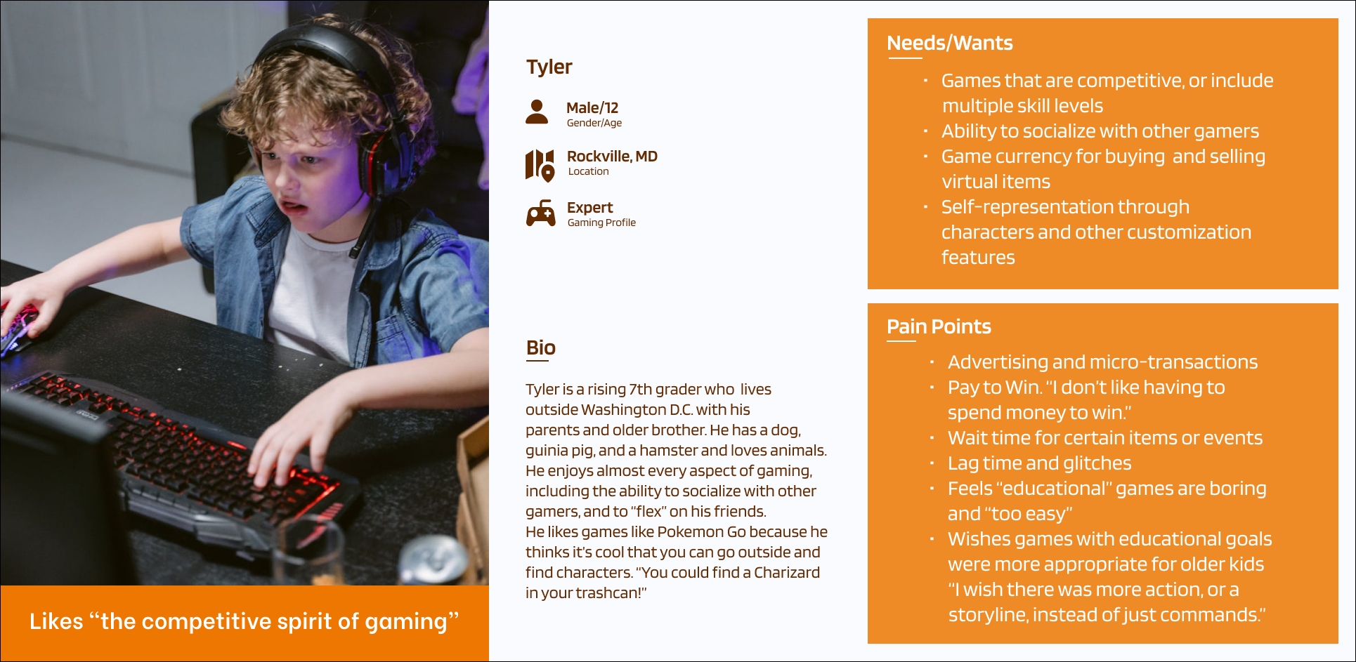
Persona
Competitor Analysis: I compared three different gaming products, and concluded that all three offered kids some level of creativity, challenge, socialization and educational content, but none of them fully met my user needs and expectations.
User Interviews: I conducted both in-person and remote interviews with a total of five kids and three parents to determine what games kids enjoy playing, and why, and what concerns and expectations parents have concerning their children’s gaming habits.
Persona: My persona is based on a 12-year-old boy who describes himself as a “gaming expert.” He says strictly educational games are “boring” and not challenging enough for older players.
Affinity Mapping: Using data from a total of eight interviews, I mapped out goals, pain points, wants/needs, gaming priorities, and desired features and discovered a surprising amount of overlap between what kids and their parents want and need from gaming products.
Feature Set: Must-have features included profile customization, augmented reality, multi-level game play, in-game currency, and player chat.
POVs/HMWs: I explored ways to make educational, community-centered gaming more attractive and engaging to older kids, who expect features such as storylines, competitive game play, and customization.

Affinity Mapping
Through my affinity mapping and other research, I discovered a number of parallels between the wants and needs of young gamers and their parents, including:
Parents and kids both love online games for their customization and creativity
Parents worry about online safety and privacy in addition to kids’ overall mental health around game play
Parents wish online games were more educational overall, and are enthusiastic about products that could also encourage in-person socialization and help foster a sense of community
Kids are drawn to games that are challenging, but not impossible, and include different levels of skill play
While younger kids are more likely to play strictly educational games, older kids lean towards game play that fosters socialization and competition
Insights
The Goal
Parents want educational, community-centric games that encourage their kids to get outside. Kids want creative, challenging and often competitive gaming experiences that feature storylines and interactive play. How to best combine gaming with outdoor play so that parents – and kids– are both satisfied?
It starts with identifying intersecting goals:
Desire for customization, creativity and competition
Necessity of educational content that is also entertaining and compelling (in the form of a storyline or narrative)
Need for multiple levels/tiers of gameplay
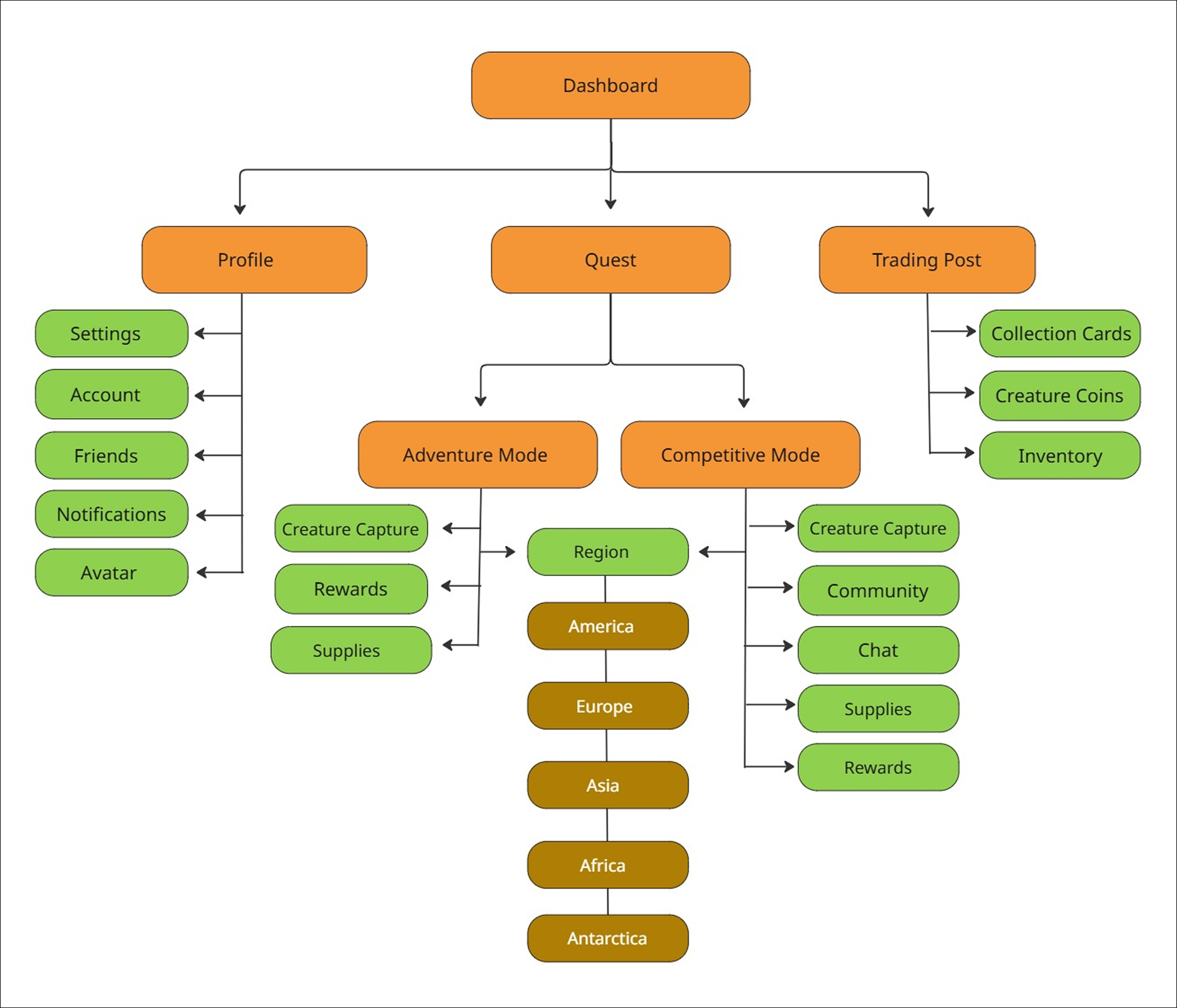
Sitemap
Information Architecture
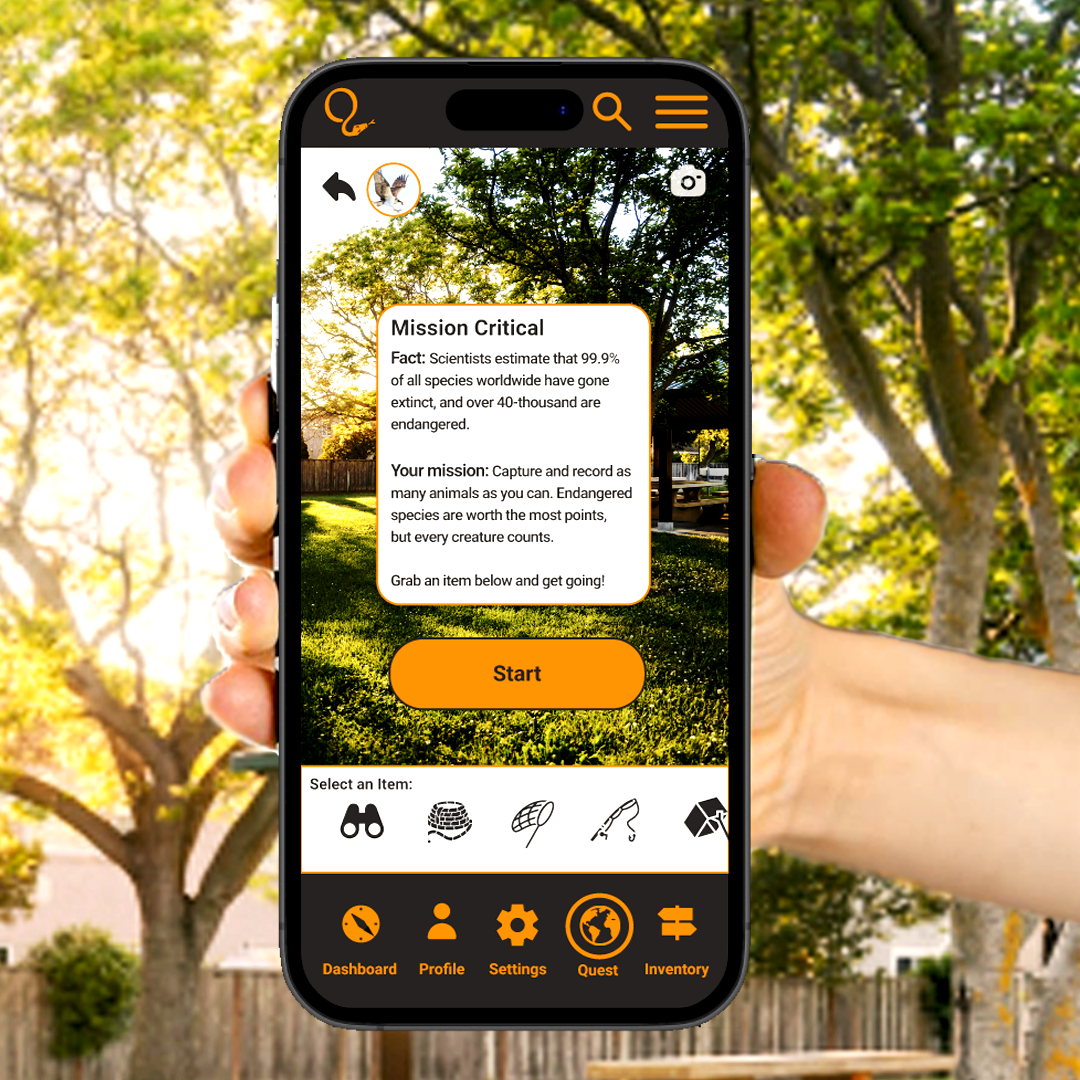
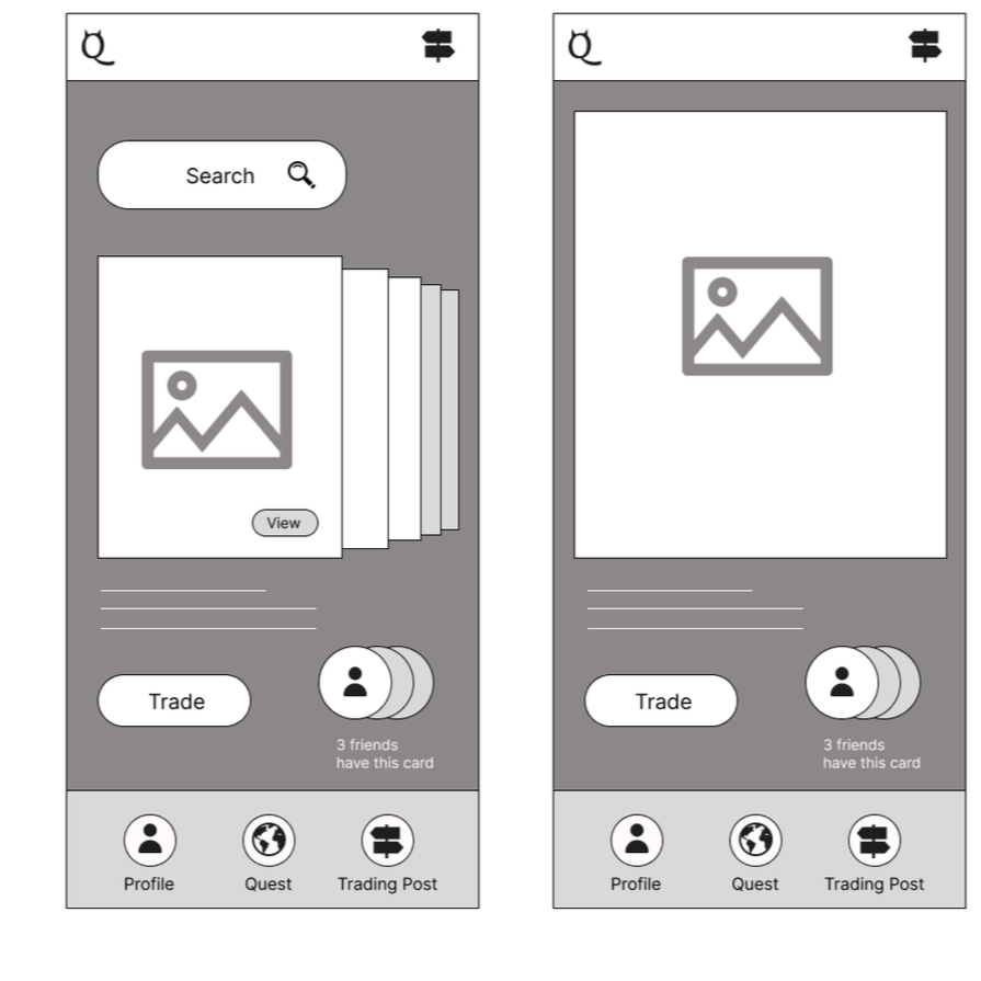
User/Task Flows: I created three possible task flows, including starting a quest, customizing your avatar, and viewing a “creature card.” These flows were chosen because they demonstrate the main objectives of my research: providing multiple levels of challenge; allowing users to customize their experience, and combining educational content with traditional game play.
Sitemap: The informational architecture illustrated in the sitemap reflects the simplicity of my interface. There are a total of five menu items, including: dashboard, settings, profile, quest, and inventory (Settings was added after several more rounds of research).
The Design
Logo Design: The logo went through several iterations, and was inspired by my desire to include an animal that could stand in for both the full logo and lettermark. The font itself acted as a catalyst for the final design, and fit the overall look and feel of the site.
Mood Board: I created a mood board that reflected the bold, bright colors I wanted to convey, along with the simple, uncluttered interface. My goal was to present the backgrounds as flat illustrations, in contrast to the striking photographs I used for the actual animals.
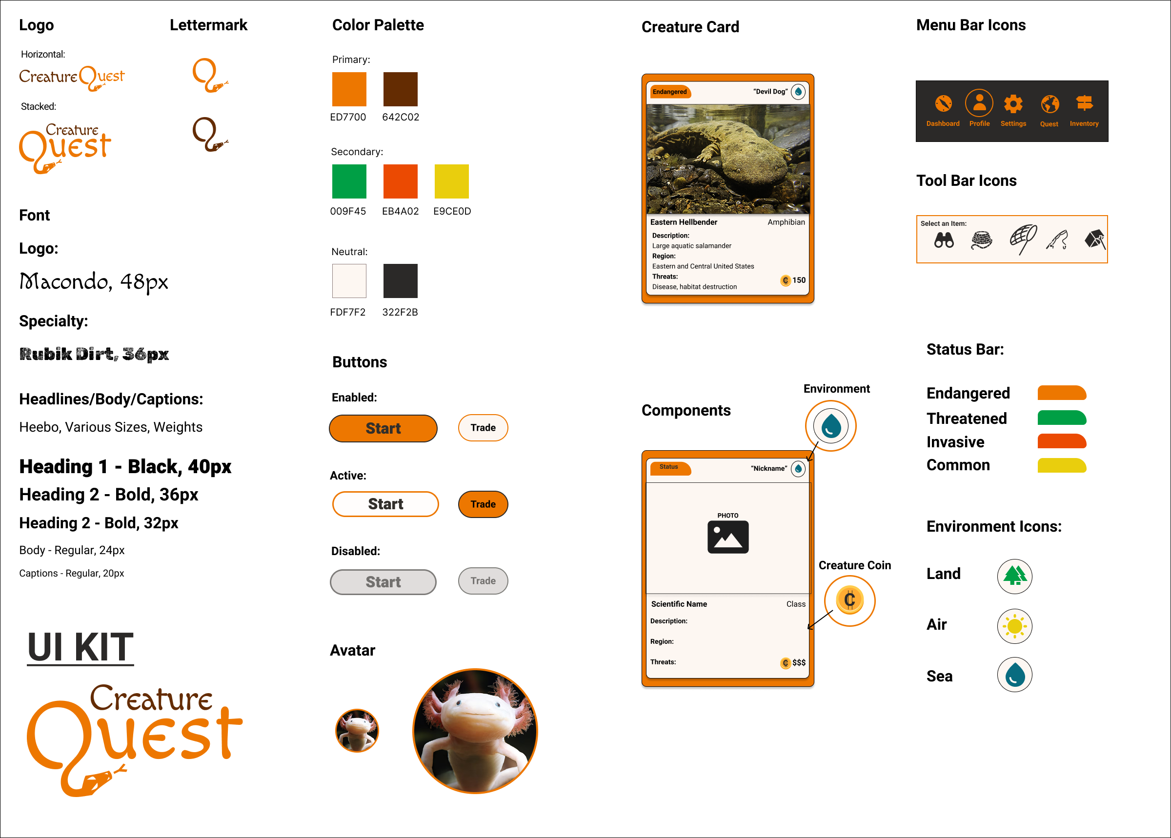
Visual Design: My color palette included primary, secondary and neutral colors, as well as a logo design and lettermark. I also included various button states, menu and tool bar icons, and components for the Creature Cards. Lastly, I included an avatar icon, illustrated in two different sizes.
Product Design
Mid-Fidelity Wireframes
Mid-Fidelity Wireframes
Early mid-fidelity wireframes were created in Figma to walk users through the three task flows, including “View A Creature Card” illustrated here. I eventually added two more menu items, and changed the card shuffle to a carousel, with user input guiding the design decisions I made in regards to what components to include and when to introduce them. I eventually changed the name “Trading Post” to “Inventory” (a more familiar gaming term) but kept the iconography of a multi-directional sign. I also added several different categories to the creature collection, including “Threatened” and “Invasive.” The lettermark in the upper left was also eventually swapped out to reflect the lettermark of the final logo.
High-Fidelity Wireframes
High-Fidelity Wireframes
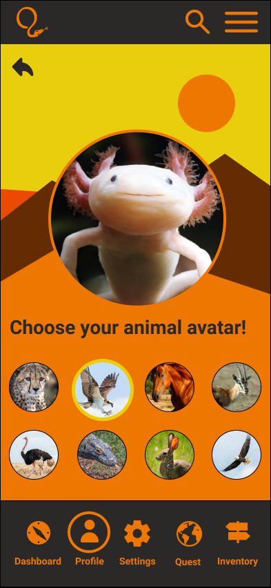
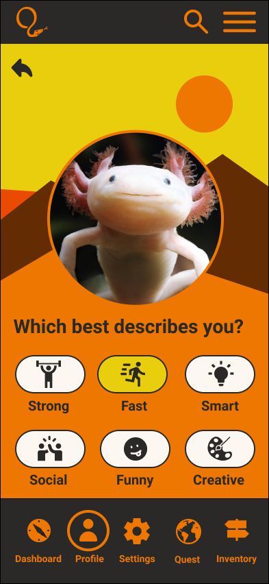
High-fidelity wireframes were created as the final step before prototyping and usability testing. These wireframes represent screens from the task flow “Customize your Avatar.” Instead of customizing your avatar according to clothing and accessories as in many other popular games, these avatar customizations reflect your personality! In this way, users who consider themselves “fast” can be a Cheetah, or a Peregrine Falcon - the fastest animals on Earth! In this way, I was able to successfully combine an educational element with a “Must-Have” feature (customization).

Key Findings/Observations:
Overall, users really liked the bright, flat colors and illustrations, and the simple, clutter-free interface. They especially enjoyed the ability to customize their avatars in accordance to their personality, and to select quests in different regions. The language and terminology, including the informational architecture, was familiar and expected for the majority of users.
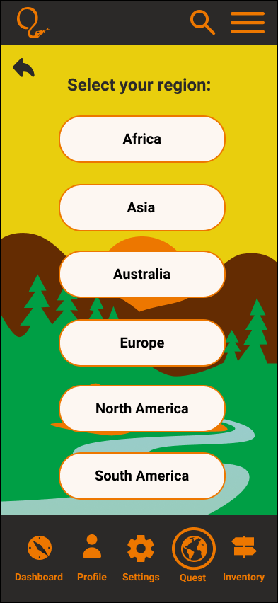
The first task flow (Begin a Quest) was the easiest to navigate, with the fewest number of errors. Several users paused on the “Select Your Region” screen, as they were unsure of which region to click on. All users appreciated the start screen for the North America Quest, however, and were eager to check out the items on the tool bar. Task flow number two (Customize Your Avatar) was equally easy to navigate. The only problem it presented was the first screen. The more experienced users knew to click on “Profile” to locate their avatar, but casual and novice users selected other options first. Once on the profile screen, users easily navigated to the animal avatar for the "Peregrine Falcon” which was indicated in the task flow. Task flow number three (Select a Specific Creature Card) posed the most complications for users, with an average time of 45 seconds, and 1.4 errors. The youngest user (age 8) was unsure what the term “inventory” meant. More experienced and older users knew to click on “inventory” right away, however. The next problem this task flow presented was the size of the preview cards, with three out of five users reporting they had trouble reading the smaller font. All users attempted to click on the actual card to enlarge it to full size. At least two users tried to click on the card for the Gray Wolf, as they assumed the “Devil Dog” - which was indicated in the task flow - was a kind of canine, suggesting those users are relying more on visuals and not actually reading the text.
Usability Testing: Prototypes were created in Figma and usability testing was conducted with five participants remotely and in-person for a total of three task flows.
Data collection included: recorded sessions and notes; observation and follow-up questions; and qualitative feedback. Success metrics included: Total time to complete the task; number of “errors”; scale rating from 1-10 for ease of use (with 10 being the easiest).
Delivery
Figma Prototype

Iteration #1: Add a drop-down menu of countries to each region
Iterations
Iterations from usability testing included the following:
Users were unsure which region to click on, so I added drop-down menus to clarify which countries were included in each region
Users had a hard time reading the smaller font on the Creature Cards, so I enlarged the size and scale of the cards in both the carousel and full-size screens
Users consistently clicked on the photos in the Creature Cards as if they were links, so I added links to the photos as an additional means of navigation
Many strictly educational games are aimed at younger users, and games for older players are not educational in the traditional sense, nor is that their mission. Older kids (between the ages of 8-13) value creativity and competition. They value socializing with their friends and other players. They enjoy being challenged. I kept all of this in mind when developing this end-to-end mobile app, which is an educational version of “Pokemon Go.” Instead of rote learning, kids are learning in the context of gaming, with all of the familiar elements that make online games so popular.
My next steps would be to further develop my existing task flows, in addition to adding new task flows to include user chats and team play options. I would build out the profile customization page by adding more avatar options, attributes and creative design features. I would solicit feedback from my users about the ways they interact with online assets such as the in-game currency, digital trading cards and items found in their inventory. Next, I would fully develop the regional missions and flesh out the creature categories, including endangered, threatened, common, and invasive species. Lastly, I would speak to parents and digital safety experts about the best available features to protect kids online.
Reflection/Next Steps

The Final Product
Task Flow #3: View a Creature Card
Set-up: View the Creature Card for the endangered Eastern Hellbender (also known as the “Devil Dog”)
