


Volunteer Dashboard: Responsive Web 2025
8 Weeks

Sole UX Designer

Figma, Miro, Zoom


Prayers answered
The St. John’s Episcopal Church Volunteer Dashboard is an all-in-one digital tool that helps streamline the organization’s volunteer recruitment and on-boarding process, and offers users a centralized communications hub. Church staff can access a volunteer database, manage ministry activites and events, and download reports on volunteer activity and fundraising efforts.
Features of this responsive internal dashboard include: Multi-user access; Calendar synching and personal “To-Do” lists; Volunteer profiles with multi-filter search and skill matching; Event planning tools including task allocation, and budget tracking; and communications tools including email, chat, auto-reminders and event-centric “message boards” accessible to both organizers and volunteers.
Chaotic! Challenging... Disorganized.
Chaotic! Challenging... Disorganized.

The Problem
St. John’s is heavily dependent on volunteers to staff ministry activites and events throughout the year, but some say it takes an act of God to identify and recruit willing and able-bodied members of their congregation. This is due in large part to a lack of centralized communication. While some organizers and volunteers rely on email, and free online tools like Sign-Up Genius, others defer to text or word-of-mouth. In the end, organizers struggle to communicate and fulfill their needs, and volunteers struggle to find opportunities that align with their schedules, interests and abilities.
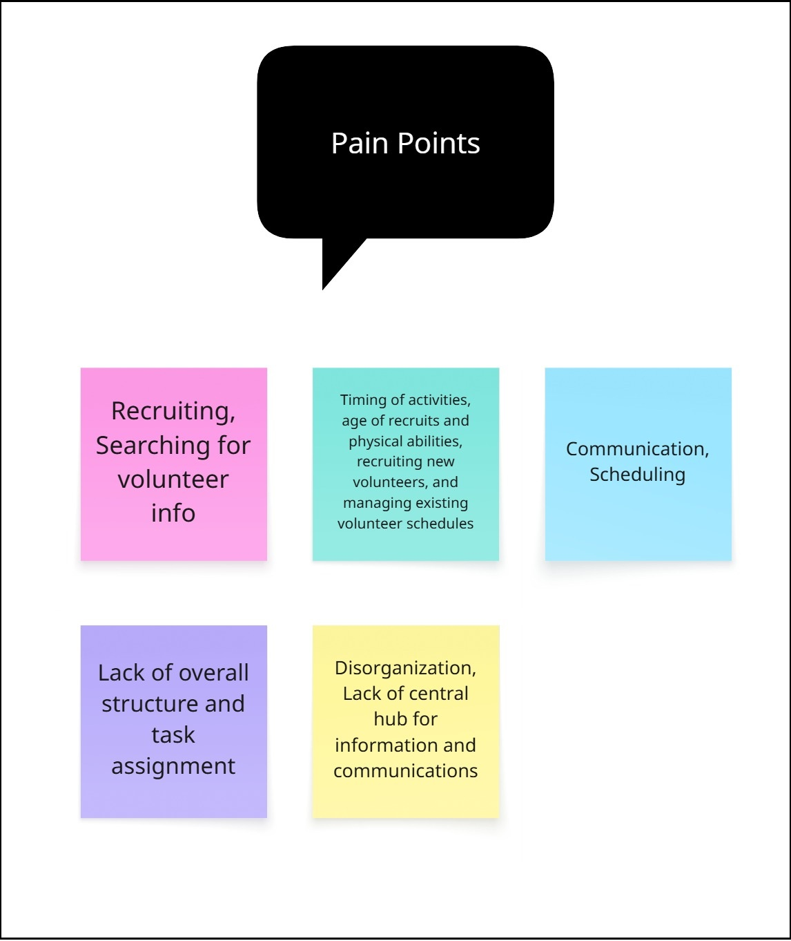
Affinity Mapping
The Research
Competitor Analysis: I compared three online tools, including Ministry Scheduler Pro, which the church currently uses. This provided me with a comprehensive list of features in which to cherry-pick for my dashboard in order to best suit the needs and expectations of my users.
User Interviews: I conducted a total of five remote and in-person interviews with both church organizers and volunteers. Users ranged in age from early 40’s to mid-70’s, and included three women and two men.
Personas: I based my persona on the church deacon, who is also one of the main event organizers. Her main objective is to find, recruit and place volunteers according to their strengths, availability and interests.
Affinity Mapping: I compared users’ emotional responses to volunteer recruitment efforts, as well as their goals, values, wants/needs, organizational priorities, volunteer priorities and desired outcomes. Organizers and volunteers shared many similar goals, pain points and desired outcomes, including the need for centralized information, more timely and consistent communication, and the ability to skill-match volunteers to available opportunities.
POVs/HMWs: For my point-of-view statements, I looked to my persona and the church accountant and administative assistant who also helps organize events. Though my persona struggled with recruiting and communicating with volunteers, the staff member reported having problems managing the event itself, including the timeline and available resources, and knowing whom to contact for more information regarding immediate needs like task completion and volunteer fulfillment.

Competitor Analysis
Insights
All of my volunteer organizers were themselves volunteers, and all of my volunteers were at some point organizers, depending on the ministry activity or event. No matter which function they were currently performing, they all served out of a sense of duty to the church and their community.
Several common themes emerged from my research including:
The need for better communication. This was a top priority/concern for both organizers and volunteers
The need for a centralized platform to better pair available volunteers with short and long-term opportunities
Overcoming barriers to volunteering, including scheduling conflicts, physical limitations and technical accessibility

The Goal
After extensive research, it became clear that my users needed a product that addressed two main goals: a centralized communication platform and a database of active volunteers who could be paired with event needs based on availability, skills, interests, and physical and technical capabilities. This last point was crucial because of the diverse range of ages in the congregation - not everyone could lift 10 lbs., or stand for long periods of time, and parishioners who worked outside the home, and/or those with young families, often faced scheduling limitations and conflicts.
The goal was simple: Get the right people to the right place at the right time.
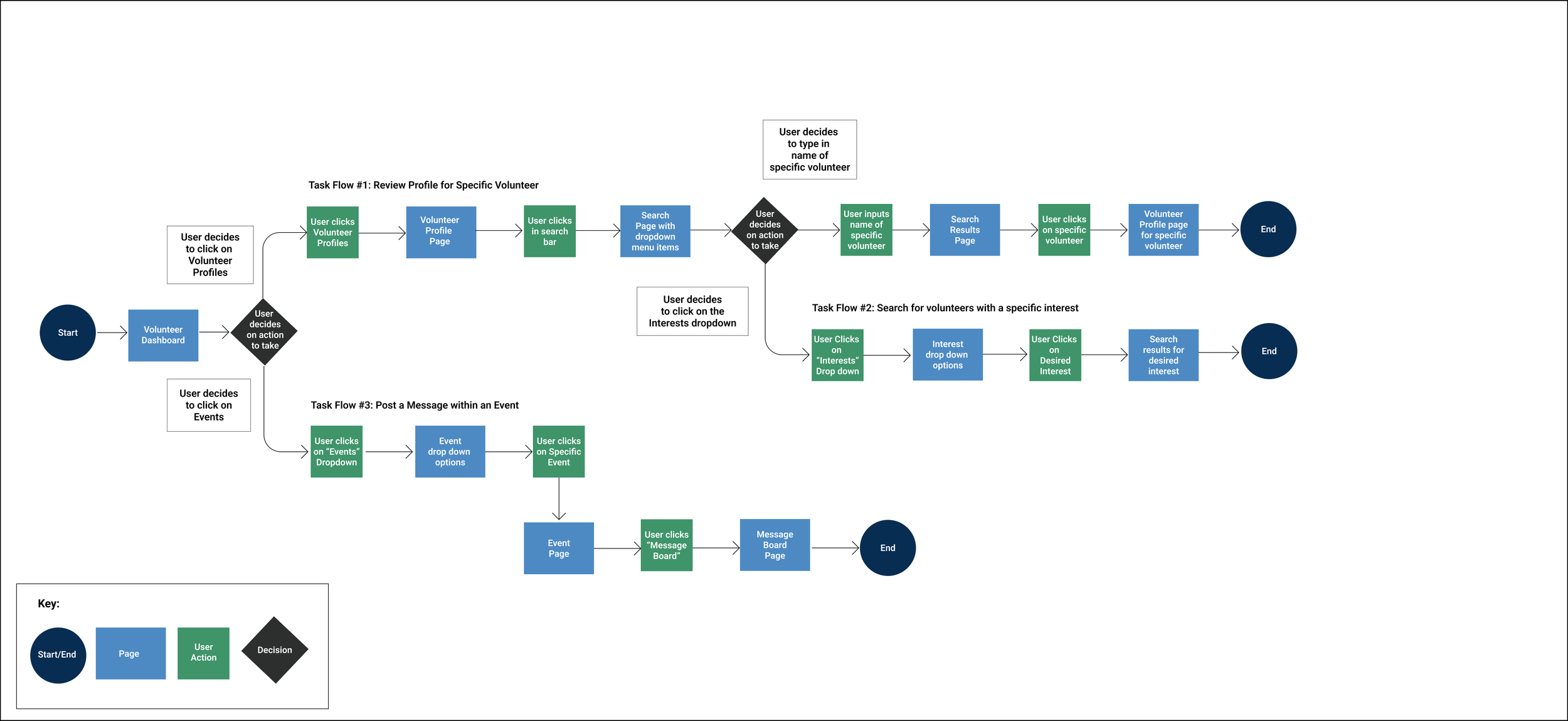
User Flows
Information Architecture
User/Task Flows: I mapped out three user flows, including reviewing the profile of a specific volunteer, seaching for a volunteer with a specific interest, and posting a message within an event. These three flows were chosen to highlight the versatility of the volunteer database, and to illustrate the ability for users to interact and communicate with eachother within the context of an event.
The Design
Feature Set: The must-have features included a volunteer database, volunteer profiles, personal task (or to-do) list, calendar, multi-search bar, and central communications hub. Nice to have features included remote event check-in, budget tracker, and a “notes” function for organizers to add to volunteer profiles. Surprising and delightful features included a fundraising tab to record earnings by month, year to date, and end of year. A Can Come Later features included a “Shift Monitor” that would allow volunteers to see who they would be working alongside for a particular event or ministry activity.
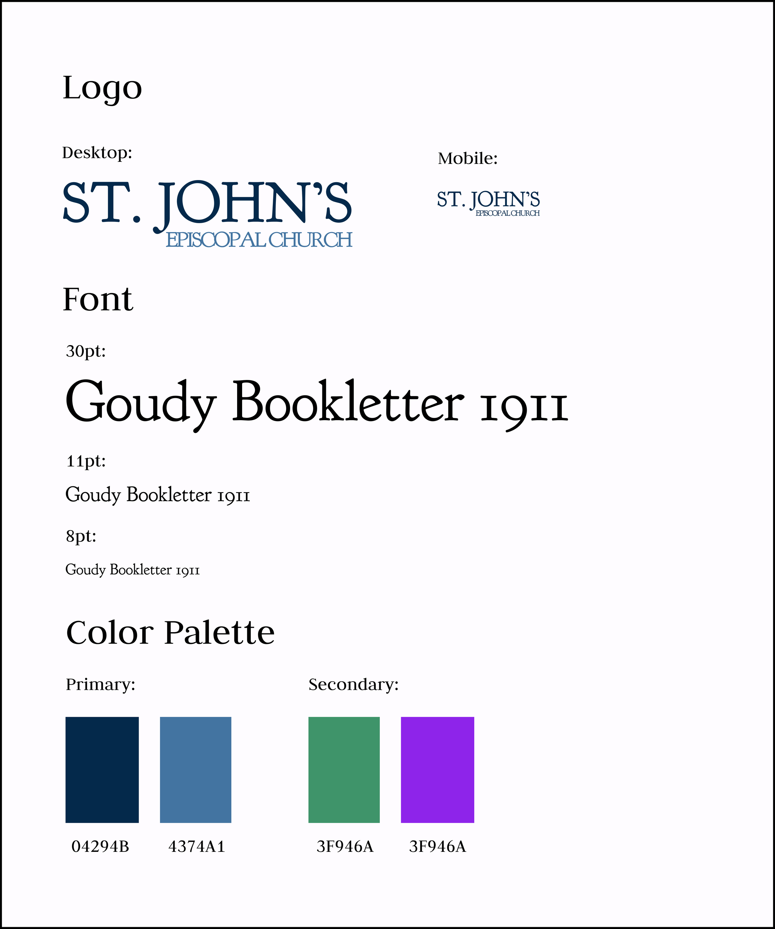
Visual Design: Since the church already had a logo and website, I borrowed from its existing color palette to design my user interface. I paired the church logo font of Felix Titling with a san sarif font (Manjari) for it’s clean look and accessibility. Users expressed a desire for a “clean, uncluttered” look and feel to the dashboard, so I kept the graphics, components and colors to a minimum in order to let the content shine.
Visual Design


Mid-Fidelity Wireframes
High-Fidelity Wireframes
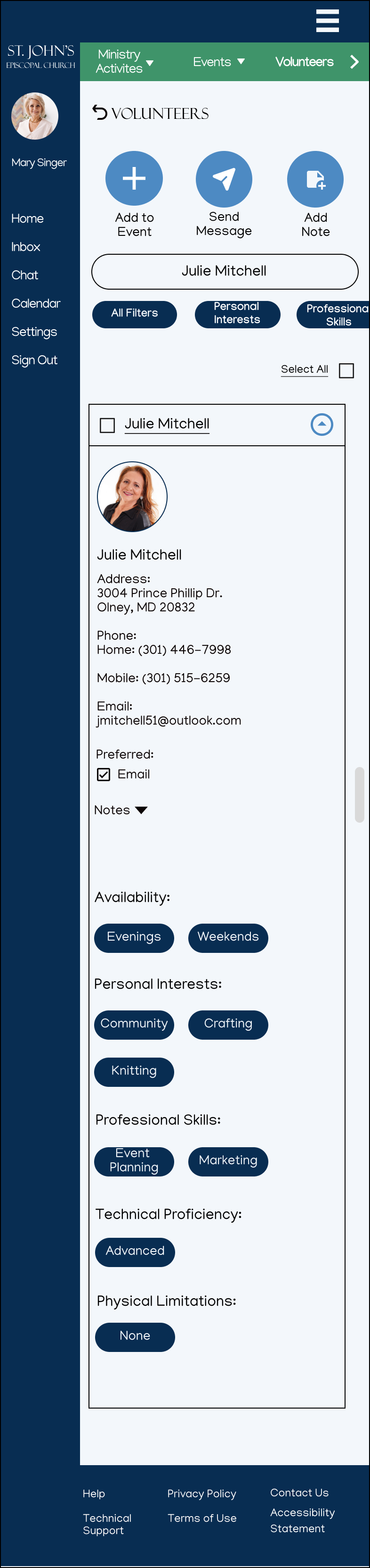
High-Fidelity Wireframes: For the high-fidelity wireframes, I removed the inactive buttons, and added category filters at the top of the profile. In addition, I streamlined the contact information by removing the check boxes and extraneous text.
Mid-Fidelity Wireframes
Mid-Fidelity Wireframes: I began with low-fidelity wireframes on paper and graduated to mid-fidelity wireframes in figma for my initial usability testing. Users were confused by the additional category buttons, and felt they took up too much space. They also suggested simplifying the contact information, and allowing users to browse volunteers by select filters.
High-Fidelity Wireframes

Figma Prototype
Key Findings/Observations
Despite being the longest, task flow three (Communicate a message to volunteers within an event) was the easiest for all participants to navigate in terms of knowing intuitively where to click, and what was expected as part of the task flow. Task flows one (Determine the availability of a specific volunteer) and two (Generate a list of volunteers by category) were more challenging to some participants because they were unsure where to start the process based on the given set-up and task. The main menu buttons on the dashboard posed some confusion as some participants attempted to carry out the requested action before first navigating to the task location. Other participants had a hard time reading some of the text including the green menu bar at the top – particularly on the mobile screens. Overall, remote testing proved challenging with participants who are not as technically savvy, and these difficulties may have played a role in the length of time if took to complete the tasks, in addition to the number of errors made. Most participants said indicator buttons, such as drop down menus and search bars worked as expected, and were easy to read and understand, and all participants found the main elements of the user interface to be simple and pleasing to the eye.
One additional observation worth noting, was the participants reaction to the search bar at the top of the list of volunteers. For task flow one, all participants bypassed the search bar and chose to scroll down the list when searching for a specific volunteer by name, but when faced with task flow two -searching by category - 50% went straight to the search bar to type in the term “baking” as opposed to clicking on the “Personal Interests” or “All Filters” buttons by which to narrow down the list of potential volunteers.
Delivery
Final PrototypeTesting: I ran remote and in-person prototype testing of three task flows with a total of five different participants. All remote testing was recorded and qualitative feedback was gathered at the end of each session.
Success metrics were determined by the amount of time it took to complete the task, the number of errant clicks per task flow, and the overall user satisfaction rating on a scale of 1-10 for ease of navigation, with 10 being the easiest.

Hover option opens dialogue box on main menu buttons to provide user with more information on expected action
Iterations
Suggestions and iterations included the following:
Users had a hard time reading the text on the green bar at the top of the screen, so I enlarged and darkened the font for easier viewing
Users consistently clicked on the entire “name” bar to open the volunteer profile, so I made the entire bar clickable (not just the drop-down button)
Users had trouble reading the smaller text, so I enlarged the text and size of the search filter buttons to make them more prominent
Users were unsure of the purpose of the main task buttons at the top so I added a hover option for desktop (long-press option for mobile) to them to open a dialogue box to include additional information on the expected action
Reflection/Next Steps
According to Axios HQ, “ineffective communication” costs businesses over $2-trillion dollars annually as of 2025.
Whether I was speaking to volunteers, or volunteer coordinators, long-term staffers, or one-time helpers, the message was clear: ineffective communication was a constant, overwhelming frustration. As such, communication became the centerpiece of my volunteer dashboard. Borrowing familiar elements from social media and sites like SignUp Genius, I developed a tool that effectively tackled the four most commonly cited issues: consolidation of information; task delegation; scheduling and follow-up; and assignment and authority (who’s doing what and who’s in charge?).
My next steps would be to take the dashboard for a spin. I would test out the volunteer database by importing the information for actual volunteers and ask coordinators to search for helpers based on various factors, including scheduling, interests and abilities. I would also do a dry-run with the event planning portal with a low-stakes event to ensure everyone was able to access the dashboard and communicate with eachother in a timely manner. Further usability testing would reveal any shortcomings, or inspire helpful additions that I may have overlooked in my initial task flows. Finally, I would build out some of the “Surprising and Delightful” elements in my feature set, including the “Shift Monitor,” which makes rotating shift-workers transparent and accessible to other volunteers.

The Final Product
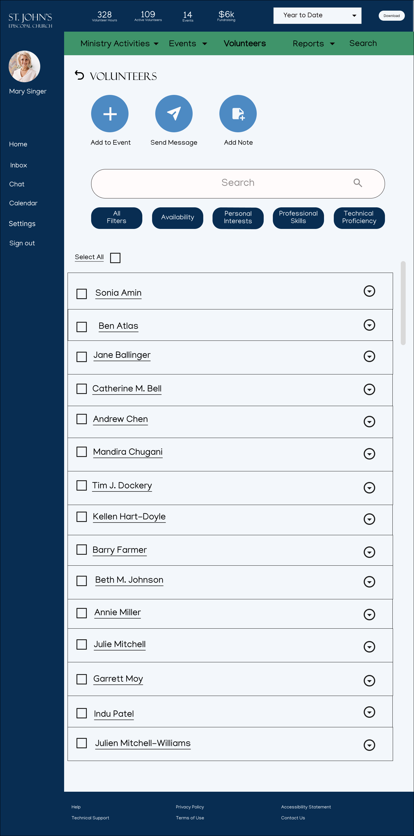
Desktop Task Flow #3: Post a message within an event
Set-up: It’s the night before the chili cook-off and you want to post a message within the event to remind volunteers to park in the back parking lot.
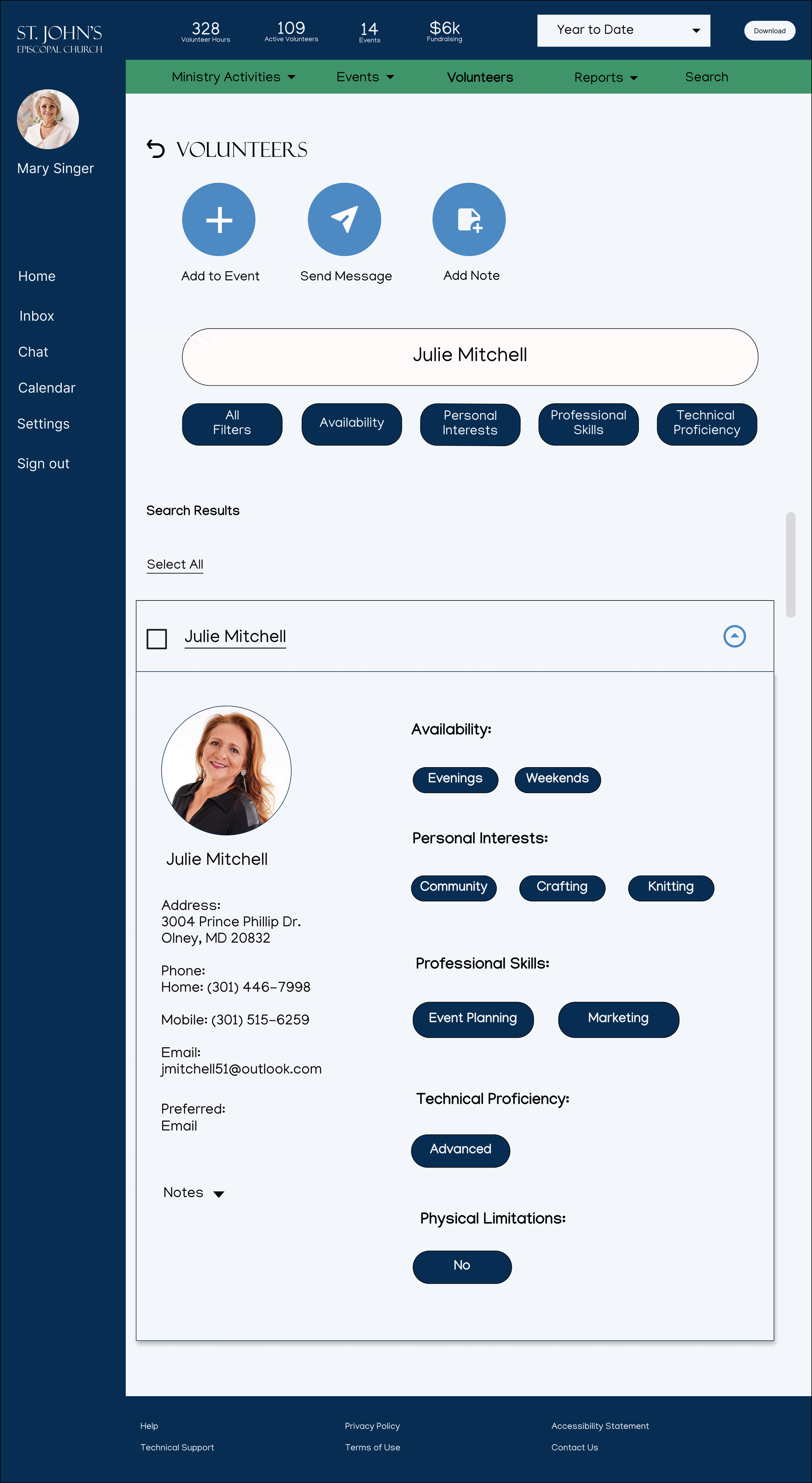
Mobile Task Flow #1: Determine the availability of a specific volunteer
Set-up: Determine the availability of volunteer Julie Mitchell