


FinTech: Add a Feature (Parental Controls) 2025
6 Weeks

Sole UX Designer

Figma, Miro, Zoom


The Greenlight debit card parental controls feature gives parents and kids an extra layer of financial protection.
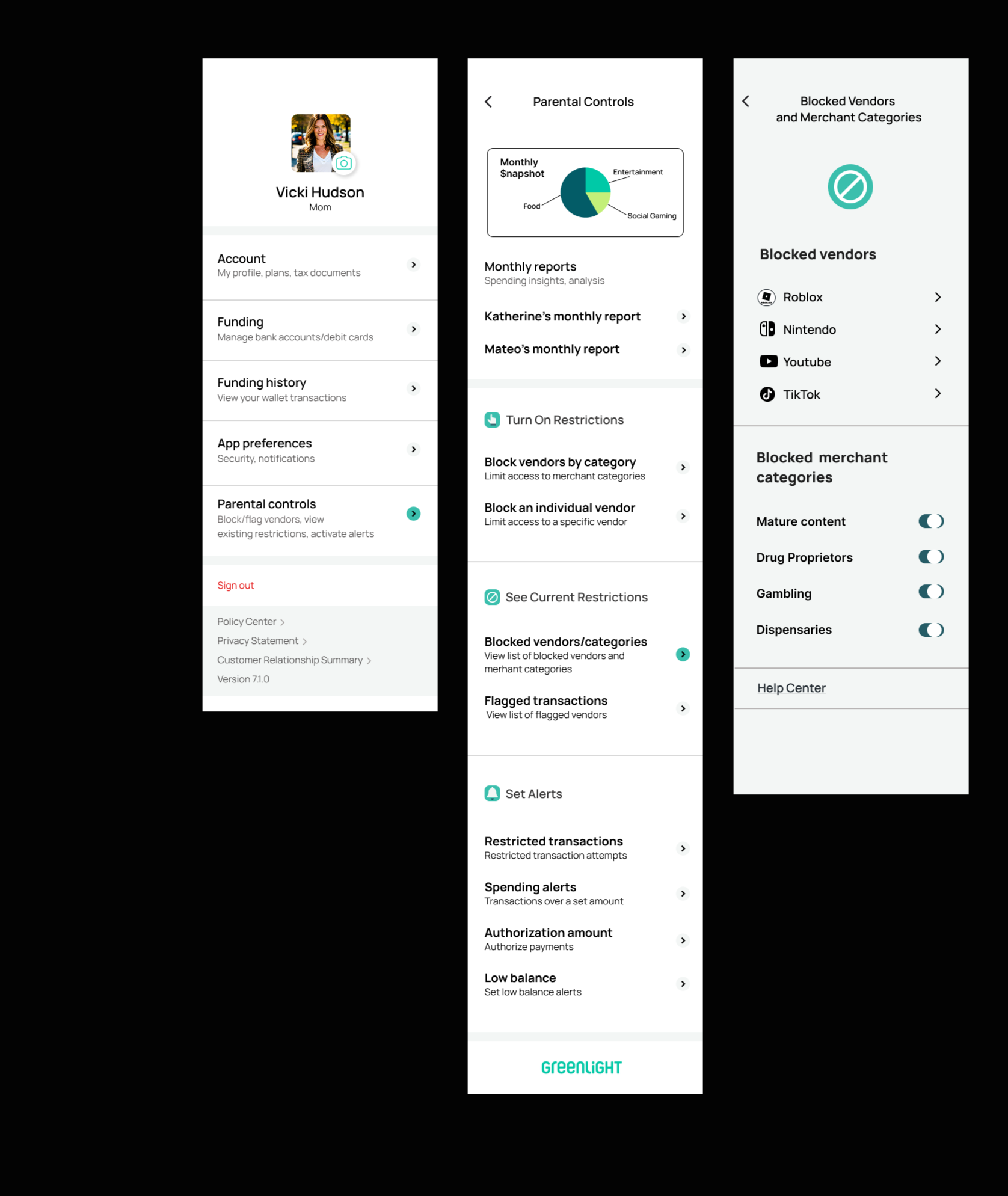
Parents can:
View shared monthly spending reports
Block and/or flag a vendor or merchant category
Set authorized payment amounts on individual transactions
Create alerts for restricted transaction attempts, suspicious transactions, spending alerts (over a specified amount) and balances that fall below a certain threshold (low balance alert)
Stop the scam before it starts

The Problem
Financial cybercrime is on the rise. The FBI says it jumped 33% in 2024, resulting in $16-billion in losses. And while older adults are the most frequent victims, children are acutely susceptible to phishing scams, unathorized purchases, identity theft and fraud -particularly within online gaming platforms- according to Common Sense Media. At the same time, 96% of Gen Z consumers (Greenlight’s target audience) make digital purchases, positioning them as the largest cohort of online shoppers.
While most credit cards extend their customers some degree of financial protection, it’s crucial a debit card used primarily by kids and teens offer additional tools to families in order to safeguard kids from scammers, hackers and other schemes that target vulnerable populations - both online and in-person.

Persona
The Research
Competitor Analysis: I compared the various features of three different checking accounts for kids and teens. Though two of the three offered some form of parental controls, none of them were comprehensive enough to meet the needs of my users. I ultimately decided to pull inspiration from all three competitors in order to create a more robust system of protection.
User Interviews: I conducted remote interviews with a total of five users. Though all my users were “Core” customers (Greenlight’s basic level of service) they enjoyed very different aspects of the card. All of them expressed interest in more substantial parental controls and oversight.
Personas: I based my persona on a 46-year-old mother of three, who uses the card for her two older children, and likes the convenience of sending money hassle-free. Like other users, she appreciates the ability to track and assign chores. She’s generally optimistic about financial technology but is unsure if they offer the same level of protection as traditional banking institutions.
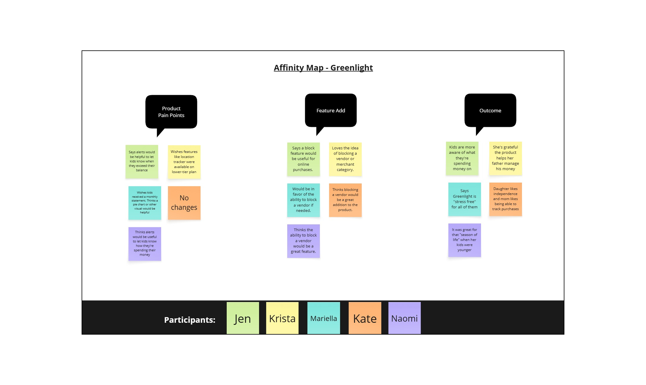
Affinity Mapping: I searched for themes in the responses of my five participants, and divided them into the following categories: emotional response to financial technology; why they chose Greenlight; goals/motivations, how/where the card was used, technical pain points, product pain points, outcome of use, and parental controls.
POVs/HMWs: I explored the following: Helping parents block or flag their children’s financial transactions and set vendor/merchant restrictions in a user-friendly, timely and effective manner; Helping parents and kids navigate unauthorized or suspicious transactions in a way that is not burdonsome or obtrusive; Giving parents visibility of transactions as they are occurring in real-time.
Affinity Map
Insights
All of my users stressed their appreciation for the card’s convenience and ease of use, and many pointed to the added benefit of teaching their kids money management skills and financial independence. Despite this, all of them were enthusiastic about the ability to proactively block an individual vendor or merchant category, as well as the option to approve a purchase in real-time that exceeds a pre-specified dollar amount.
Breakdowns:
More than half of the families interviewed use the cards online
100% participate in the basic “Core” level of service, which currently doesn’t offer any financial monitoring or identity theft protection
Most commonly cited goals for card usage were convenience and independence
All participants expressed an interest in more robust parental controls and oversight

The Goal
My users value convenience and independence. It was the most often-cited reason they chose to use Greenlight in the first place. As such, my number one goal was to make the parental controls feature as accessible and unobtrusive as possible while still providing parents with the safeguards they desire. With this in mind, I embraced flexibility and developed a “before” and “after” mindset. All of the features I developed as part of my parental controls can be enacted before the card is ever used, and after a purchase is discovered. Likewise, all blocks can be viewed or changed at any time with the touch of a button. Lastly, shared spending reports and alerts between parents and kids give them a sense of agency and helps to instill financial independence, which was a top priority for parents.
Information Architecture
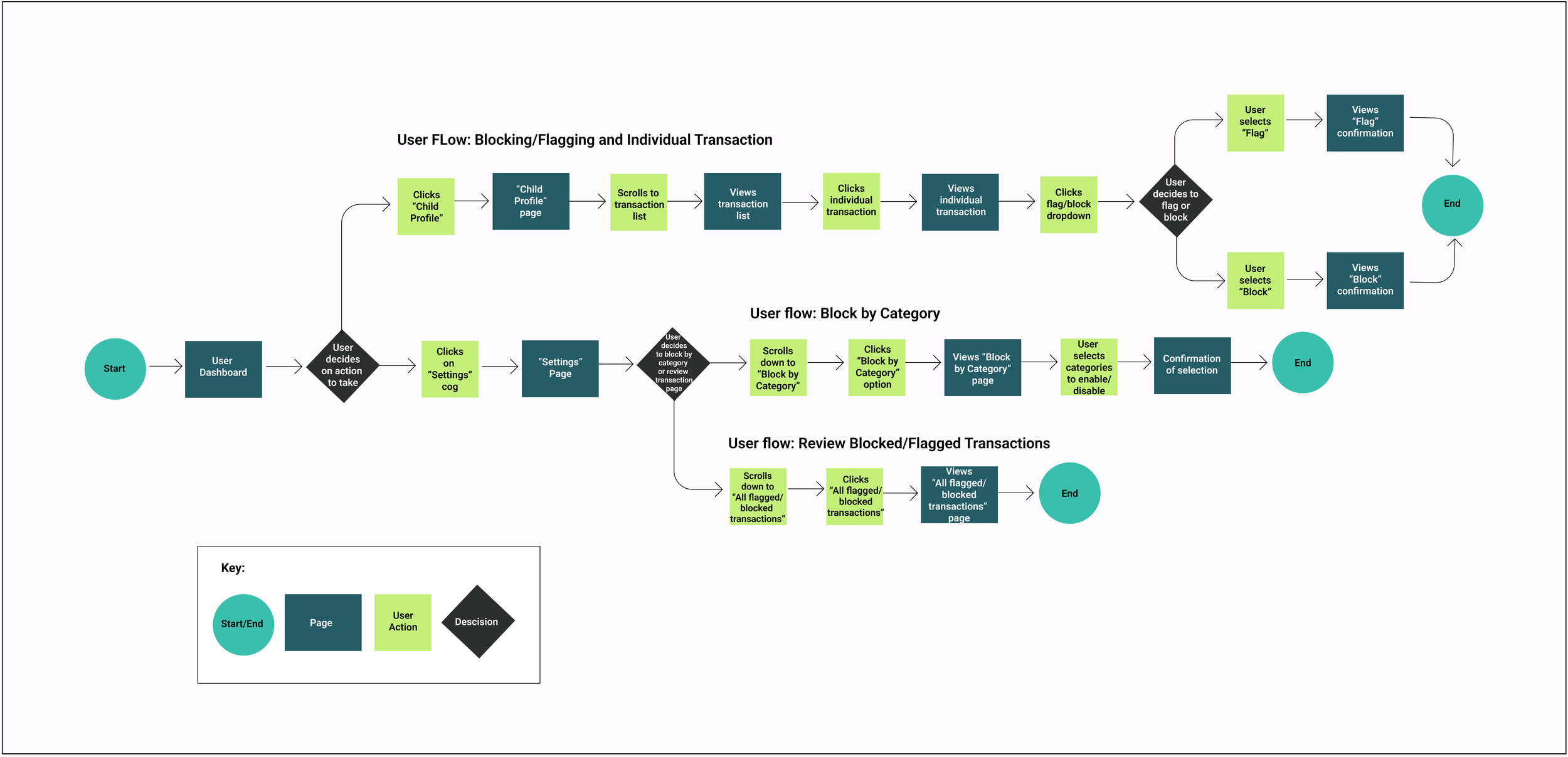
User Flows
User/Task Flows: I mapped out three user flows including: Blocking/Flagging an individual transaction; Block by merchant category; Review blocked/flagged transactions. These flows were chosen as they best demonstrate the priority features of my parental controls page.
Feature Set: My must-have features include: Block/flag vendor/merchant category; Suspicious transaction alerts; and Blocked merchant/vendor lists. Nice to have features include: Child-friendly financial report; Direct-deposit; and PIN reminders. Surprising and delightful features include: Graduated accounts, and Custom UI views.
Product Design: As this is an established brand, I stayed true to the organization’s color palette, style, logo and font. In lieu of their custom font, I used Manrope - a clean, san-serif font - in various weights, for the headlines and text, which is clean and easy to read. I also downloaded various user screens from their press kit to mimic the basic look and feel of the app, including the spacing, components, and iconography used in their existing UI.
Mid/High Fidelity-Wireframes: I developed mid and high-fidelity wireframes of the three user/task flows, and ran a total of two usability tests, with early user feedback integrated into the later testing of my high-fidelity prototypes.
The Design
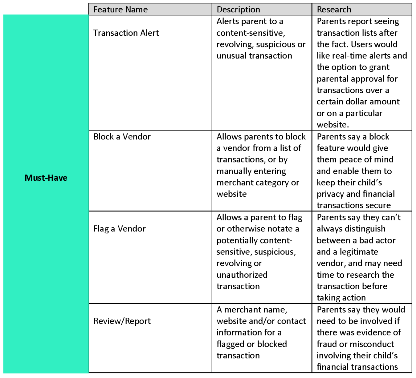
Feature Set
Task Flow #3
View a list blocked vendors
Mid/High Fidelity Wireframes
I developed mid and high-fidelity wireframes of the three user/task flows, and ran a total of two usability tests, with early user feedback integrated into the later testing of my high-fidelity prototypes.

High-Fidelity Prototype
Key Findings/Observations
Task Flow #1 (Block a Vendor): Users found the navigation for the first task flow to be easy and fairly intuitive once they clicked on the “View All Transactions” list. Of the three task flows however, this took the longest to complete as users were unsure where to start.
Task Flow #2 (Block a group of vendors or merchant category): Users found this task very intuitive and thought the navigation was clear, though it was more information to parse through than the previous task. They loved the addition of the Parental Controls page but found it to be a bit text-heavy, and sometimes had a hard time differentiating between action items versus items to review.
Task flow #3 (Review a list of blocked vendors and merchant categories): Users found this easy to navigate as it also included the fewest number of screens. Having familiarized themselves with the “Parental Controls” in the previous task, they had a much easier time identifying the section header for the list of blocked sellers.
Prototyping/Usability Testing:
I conducted remote usability testing of high-fidelity prototypes with five participants on three different task flows.
Delivery


Original
Iteration
Iterations
The iteration illustrated here was based on feedback from task flows #2 and #3 (Block a group of vendors or merchant category; Review a list of blocked vendors/merchant categories) to create more “white space” as the original was a bit text-heavy and hard to read. Users also suggested simplifying and shortening the descriptions and putting the headings in bold font. Finally, they recommended adding icons to the headings to further clarify the action or expected outcome.
From task flow #1, iterations included:
Including a link to parental controls under the “Manage Card” option as this was often the first place users clicked.
Adding a short description under the “Manage Card” button to specify its scope/function
Reflection/Next Steps
You know what economy cars and high-end vehicles have in common? Seatbelts. Why? Because consumers deserve to feel safe - both on the road and online. Safety is a neccessity, not a luxery. Yet, all of my users were customers of Greenlight’s lowest-tier plan, which doesn’t offer the same safety features as their premium plan. And when kids are involved, the stakes are arguably higher. Going forward, I would implement not only all of the safety features outlined in this case study, but I would ensure it was available to customers at every price point. In addition, I would further develop aspects of the Parental Controls page, including the monthly snapshots and reports. I would also refine the search process for vendors and merchant categories by conducting more user testing to better understand parents’ specific concerns. Finally, I would assess how users prefer to interact with features such as alerts and messaging, including how, when and where to apply them.
Understanding user’s motives and expectations frames at least half of my design, but the other half is framed by their values. Safety was a top priority for my users (and parents, in general), but it shouldn’t come at the cost of convenience. And it certainly shouldn’t cost extra. The key is combining the “right-now” convenience they expect, with the independence they hope to foster, with the everyday safety they deserve.

The Final Product
Task Flow #1: Block a vendor
Set-up: You spot an unfamiliar transaction and you want to block future purchases. Block the vendor, “Roblox”